
Professional Web Design & Next.js UI/UX Engineering Services | Fekra Labs
We craft visually stunning, psychologically compelling, and ultra-fast web experiences. Combining bespoke Figma atomic design systems, thumb-zone mobile ergonomics, and sub-second Next.js engineering, we transform visitors into loyal brand advocates across Egypt, Saudi Arabia, and the GCC.
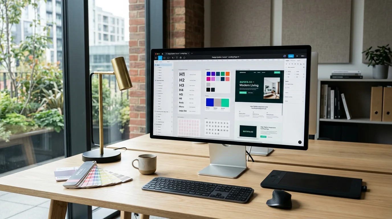
What web design services does Fekra Labs provide?
Fekra Labs provides enterprise UI/UX web design and frontend engineering services, including bespoke Figma design systems, mobile-first responsive interfaces, native bidirectional Arabic RTL and English LTR layouts, conversion rate optimization (CRO), and production Next.js 15 frontend implementation. Every project is delivered with 100% intellectual property ownership, zero generic templates, and guaranteed sub-second Core Web Vitals.
1. Strategic Executive Overview & Business Value Proposition
Transforming Enterprise Operations from Constrained Software Renters into Sovereign Digital Leaders
In the contemporary competitive landscape across Egypt, Saudi Arabia, and the United Arab Emirates, corporate web design is no longer a superficial cosmetic exercise—it is the direct visual embodiment of your enterprise authority, customer trust, and commercial conversion capability. Discerning corporate buyers, high-net-worth consumers, and institutional partners form an indelible impression of your brand within 50 milliseconds of landing on your website. When an organization relies on generic templates, outdated visual clutter, or clunky mobile viewports, it instantly communicates a lack of technical capability and surrenders market leadership to more agile digital competitors.
At Fekra Labs, our enterprise UI/UX web design practice combines cognitive psychology, conversion rate optimization (CRO), atomic design systems, and modern frontend architecture. We design bespoke, high-performance digital experiences tailored specifically to the visual expectations and behavioral patterns of regional and international audiences. Every layout, typography scale, micro-interaction, and call-to-action is engineered with scientific precision to guide visitors effortlessly through high-converting user journeys while cementing unassailable brand authority.
Target Organizations for Enterprise UI/UX Web Design
- Corporate Holdings & Multi-Subsidiary Conglomerates: Established enterprises requiring prestigious, cohesive digital brand identities that showcase diverse business units while maintaining corporate governance and investor credibility. - High-Growth B2B Consultancies & Financial Firms: Legal advisors, investment banks, and professional service providers that require high-trust visual aesthetics to justify premium fee structures and attract enterprise clientele. - Healthcare Conglomerates & Medical Networks: Hospital networks and diagnostic centers requiring accessible, calming, and intuitive interfaces that simplify physician discovery and online appointment booking for patients of all ages. - Luxury Real Estate Developers & Architectural Firms: Premium property developers requiring immersive visual storytelling, full-bleed imagery, interactive masterplans, and elegant typography to market multi-million-dollar developments.Critical Visual & Conversion Deficits Solved by Fekra Labs Design
1. The 'Cookie-Cutter' Template Cliché: Generic WordPress and Shopify templates make your company look indistinguishable from low-cost competitors, destroying brand differentiation and depressing pricing power. 2. Terrible Mobile Touch Ergonomics: Over 75% of regional web traffic originates from mobile devices. Generic desktop-first designs retrofitted for mobile feature microscopic fonts, broken navigation drawers, and impossible-to-tap buttons that cause massive bounce rates. 3. Severe Arabic RTL Layout & Typography Breakage: Treating Arabic as a secondary translation results in awkward left-aligned layouts, inverted icons, clipped headings, and illegible font choices that alienate regional Arabic-speaking buyers. 4. Visual Clutter & Cognitive Overload: Websites that attempt to display everything at once overwhelm visitors, resulting in decision paralysis and low inquiry completion rates.Quantifiable Operational ROI Delivered by Fekra Labs Design
- 100% Bespoke Design System in Figma: Fully customized atomic components, design tokens, and interactive prototypes owned completely by your organization. - 30% to 70% Increase in Lead Conversion Rates: Evidence-backed visual hierarchies, thumb-zone mobile ergonomics, and high-contrast call-to-action buttons. - Flawless Bilingual Arabic (RTL) & English (LTR) Mastery: Authentic layout mirroring and tailored typography delivering natural visual flow for regional users. - Zero Cumulative Layout Shift (CLS < 0.05): Strict aspect-ratio enforcement and font-fallback metrics ensuring instantaneous visual stability.2. What is Enterprise UI/UX Web Design? (Architectural Foundations)
Deconstructing Bespoke Software Architecture, Domain-Driven Design, and Polyglot Persistence
Enterprise UI/UX web design is the comprehensive, multidisciplinary engineering of user interfaces (UI) and user experiences (UX) designed to guide human behavior, communicate brand values, and achieve specific commercial conversion outcomes. Unlike basic graphic styling, enterprise web design is a rigorous discipline grounded in visual ergonomics, cognitive psychology, accessibility standards, and frontend performance constraints.
The Four Architectural Pillars of Modern Web Design at Fekra Labs
1. Atomic Design Systems & Modular Token Architectures
We structure digital interfaces adhering to Brad Frost’s Atomic Design methodology. We construct design systems beginning with foundational Atoms (color tokens, font variables, border radii, spacing scales), assembling them into Molecules (search bars, input groups), Organisms (navigation bars, card grids), Templates (page layouts), and fully hydrated Pages. By declaring all visual attributes as centralized design tokens in Figma, our designs translate seamlessly into CSS custom properties and Tailwind utility classes, guaranteeing multi-platform consistency.2. Mobile-First Thumb-Zone Ergonomics
With mobile devices driving the vast majority of traffic in Egypt and the GCC, we design every screen mobile-first. We map interface elements strictly against natural human hand ergonomics: placing primary navigation bars and high-frequency interactive triggers within the natural "thumb reach zone" at the bottom of the screen, while positioning secondary informational content in the upper visual scanning zones. Tap targets are engineered with a minimum hit dimension of 48x48 pixels to eliminate accidental clicks.3. Native Bidirectional Arabic RTL & English LTR Architecture
Serving Middle Eastern markets requires native bidirectional layout engineering. In Arabic right-to-left (RTL) reading, visual scanning pathways mirror those of Western interfaces: the eye moves from top-right to bottom-left. We engineer mirrored layout structures, reversed directional iconography (arrows, chevrons), and select premium Arabic typefaces (such as Cairo or IBM Plex Sans Arabic) calibrated with proper diacritical kerning and balanced vertical metrics.4. Cognitive Ergonomics & Conversion Funnel Engineering
We apply proven cognitive heuristics—including Hick’s Law (reducing choices to minimize decision time), Fitts’s Law (making key targets large and easily accessible), and the Von Restorff effect (making core CTA buttons visually distinct). We eliminate friction by breaking complex inquiries into progressive disclosure multi-step flows, placing reassurance badges near high-friction submission buttons, and maintaining clear visual hierarchies that guide visitors effortlessly toward conversion.3. Why Enterprise Leaders Choose Bespoke Design Over Templates
Eliminating the Innovation Ceilings, Hidden Taxes, and Data Liabilities of Generic Software Packages
In the modern digital economy, enterprise design is not an aesthetic luxury; it is a vital competitive moat that directly dictates business valuation, customer acquisition cost (CAC), and commercial conversion velocity. Relying on outdated designs or low-cost commercial templates imposes crippling liabilities on enterprise growth.
Strategic Liabilities of Low-Cost Website Templates
1. The 'Commodity' Perception Deficit: Sophisticated B2B buyers evaluate your digital presence to gauge institutional stability. A generic template communicates that your company cuts corners, encouraging prospects to negotiate aggressively on price or take their business to established competitors. 2. Crippling Mobile Conversion Friction: Generic templates are notoriously clunky on mobile devices. Intrusive popups, awkward mobile menus, and poorly formatted forms frustrate smartphone users, resulting in high bounce rates and wasted digital advertising spend. 3. Inability to Adapt to Brand Evolution: Commercial templates are rigid. When your enterprise launches a new service line, alters its corporate structure, or requires an interactive ROI calculator, templates break or require clunky visual compromises. 4. Lack of Asset Equity and Ownership: When you rely on third-party commercial themes, you own zero design intellectual property. If the theme developer abandons updates, your digital presence becomes obsolete and vulnerable to security failures.4. What Fekra Labs Delivers: Full-Spectrum Design Scope
From Architectural Blueprints to Production CI/CD Infrastructure: Complete Turnkey Ownership
Fekra Labs delivers end-to-end enterprise UI/UX web design services, guiding your organization from strategic brand discovery to a fully realized design system and pixel-perfect developer handoff:
Full Scope of Web Design Deliverables
- Bespoke Figma Atomic Design System: Reusable component library, typography styles, color tokens, and responsive layout grids owned 100% by your enterprise. - Desktop, Tablet, and Mobile Responsive Artboards: Complete high-fidelity screen designs for all unique page templates across all device viewports. - Authentic Bilingual Arabic (RTL) & English (LTR) Layouts: Fully mirrored visual interfaces with tailored typography and localized iconography. - Interactive Click-Through Prototypes: High-fidelity prototypes in Figma simulating menus, modal dialogs, hover states, and complete conversion flows. - Comprehensive Developer Handoff Specifications: Exact CSS token definitions, spacing scales, exported SVG vectors, and responsive breakpoint guidelines. - 100% Intellectual Property Ownership: Irrevocable worldwide transfer of all Figma design files, brand assets, and design token libraries with zero vendor lock-in.5. Core Architectural & Design Capability Matrix
10 Enterprise Capabilities Engineered for High Concurrency, Zero Downtime, and Fault Tolerance
Our capabilities cover the entire spectrum of digital design, from atomic design systems to high-fidelity prototyping and conversion rate optimization:
Atomic Design Systems & Reusable Token Architectures
Constructing scalable, multi-brand Figma design systems based on atomic design principles (atoms, molecules, organisms), unified with CSS custom properties for effortless cross-platform consistency.
Mobile-First Touch Ergonomics & Responsive Layouts
Engineering responsive viewports tailored to thumb-zone ergonomics, fluid typography scales, and adaptive container queries ensuring flawless usability across smartphones, tablets, and desktop displays.
Native Bidirectional Arabic RTL & English LTR Design
Designing authentic bilingual interfaces with mirrored layout hierarchies, localized iconography, and optimized Arabic typography (Cairo, IBM Plex Sans Arabic) with zero awkward visual clipping.
Conversion Rate Optimization (CRO) & User Journey Funnels
Structuring intuitive visual hierarchies, high-contrast call-to-action (CTA) buttons, and low-friction lead capture forms grounded in Fitts’s Law and cognitive psychology to maximize conversion.
WCAG 2.1 AA Accessibility & Inclusive Visual Standards
Ensuring strict compliance with international accessibility guidelines: 4.5:1 color contrast ratios, clear keyboard focus indicators, screen-reader friendly ARIA landmarks, and scalable type.
High-Performance Micro-Interactions & 60fps Motion
Implementing lightweight CSS transforms and GPU-accelerated motion systems that provide instant tactile feedback without inducing layout repaints or degrading Core Web Vitals.
Enterprise Dashboard & Data Visualization UX
Architecting complex administrative portals, financial dashboards, and data analytics grids with intuitive filtering, dark/light themes, and clear information hierarchies.
Interactive High-Fidelity Prototyping & Usability Audits
Building fully interactive, clickable prototypes in Figma tested against real enterprise operators to measure task completion rates and validate user workflows prior to frontend coding.
Design-to-Code Engineering with Next.js & Tailwind CSS
Bridging the design-engineering divide by directly compiling Figma design tokens into production-ready Tailwind CSS variables and accessible React component primitives.
Continuous User Behavior Telemetry & Heatmap Optimization
Instrumenting post-launch behavioral analytics (Microsoft Clarity, Hotjar, GA4) to analyze scroll depths, rage clicks, and conversion bottlenecks for iterative design refinement.
6. Enterprise Case Studies & Real-World Transformation Scenarios
In-Depth Engineering Analyses of Scaled Logistics, FinTech, and Healthcare Deployments
The following case studies illustrate how Fekra Labs custom UI/UX design transforms enterprise digital platforms into high-converting market leaders:
Case Study 1: Complete Digital Brand Modernization for an Investment Group
- Client Profile: A private equity and real estate investment holding company managing over $250M in assets across Cairo and Riyadh. - Design Challenge: The client’s existing website looked outdated and cluttered, failing to convey the sophisticated institutional scale required to attract international co-investors and regional family offices. - Fekra Labs Solution: - Designed an ultra-clean, minimalist corporate portal in Figma featuring deep navy and warm platinum color tokens. - Engineered an interactive portfolio showcase with structured investment metrics, sector filtering, and downloadable investor fact sheets. - Implemented authentic bilingual Arabic RTL and English LTR layouts with custom Arabic typography. - Measurable Business Impact: - Average user session duration increased by 160%, reflecting high engagement with portfolio assets. - Inbound institutional co-investment inquiries increased by 85% within 6 months of launch. - Design was recognized as an industry benchmark for regional private equity web presence.Case Study 2: Mobile-First UX Redesign for an E-Commerce Luxury Retailer
- Client Profile: An omnichannel luxury fragrance and beauty retailer operating 14 retail boutiques across the UAE and Saudi Arabia. - Design Challenge: Despite heavy mobile traffic from Instagram and TikTok ads, the mobile conversion rate was an abysmal 1.2% due to cluttered product pages and a frustrating 5-step checkout process. - Fekra Labs Solution: - Re-engineered the mobile UX around thumb-zone ergonomics, placing dynamic "Add to Bag" triggers permanently accessible at the bottom of the screen. - Simplified product pages with high-resolution image carousels, expandable accordions for ingredient notes, and clear delivery timelines. - Redesigned checkout into an effortless 2-step flow with Apple Pay and Mada one-tap payment options. - Measurable Business Impact: - Mobile checkout conversion rate jumped from 1.2% to 3.8%, generating over $420,000 in incremental revenue within 90 days. - Mobile cart abandonment rate plummeted by 44%. - Customer review ratings on mobile usability surged from 3.1 to 4.8 out of 5 stars.Case Study 3: B2B SaaS Dashboard & Portal UX for a Logistics Platform
- Client Profile: A fast-growing freight management SaaS platform connecting enterprise shippers with commercial trucking fleets across Egypt. - Design Challenge: Enterprise logistics dispatchers were overwhelmed by dense, unformatted tables and unintuitive menus, resulting in high onboarding friction and frequent operator errors. - Fekra Labs Solution: - Engineered an atomic design system for complex data grids featuring customizable column views, real-time status badges, and inline quick actions. - Designed an intuitive dark-mode operational dashboard optimized for multi-monitor logistics control centers. - Created interactive Figma prototypes tested with real dispatchers to optimize dispatch workflow completion speeds. - Measurable Business Impact: - Dispatcher task completion time was reduced by 52%, allowing teams to handle double the freight volume. - Operator onboarding time dropped from 3 weeks to 3 days due to intuitive information hierarchies. - Churn rate among enterprise shipping clients fell by 65%.7. The 15-Stage Enterprise Web Design Lifecycle (SDLC)
A Disciplined, Transparent Engineering Methodology Ensuring Fixed Budgets and Flawless Execution
Our 15-stage enterprise web design lifecycle guarantees creative excellence, rigorous usability validation, and seamless developer handoff:
1. Brand Discovery & Cognitive Stakeholder Alignment: Workshops defining brand positioning, visual aesthetics, user personas, and commercial KPIs.
2. User Persona Modeling & Empathy Mapping: Developing research-backed user personas and competitive visual benchmark audits.
3. Information Architecture & Conversion Sitemaps: Structuring website hierarchies, navigation trees, and conversion funnels.
4. Low-Fidelity Wireframing & Content Layout Strategy: Drafting structural wireframes focusing on message hierarchy and visual scanning paths.
5. Design Token Architecture & Color Palette Strategy: Establishing accessible color tokens, typography scales, and modular spacing systems.
6. Figma Atomic Component Library & Auto-Layout System: Building reusable UI components with interactive variants and hover states.
7. Bilingual Layout Mirroring & Arabic RTL Typography: Crafting mirrored Right-to-Left (RTL) Arabic interfaces with customized typography.
8. Interactive High-Fidelity Clickable Prototyping: Assembling complete clickable prototypes in Figma simulating real user flows.
9. Usability Testing & Operator Validation Sessions: Moderated testing with target users to detect and eliminate workflow friction points.
10. Accessibility Auditing & WCAG 2.1 AA Verification: Evaluating color contrast ratios, focus indicators, and keyboard navigation.
11. Micro-Interaction Design & Motion Choreography: Choreographing subtle feedback animations that enhance tactile responsiveness.
12. Developer Handoff & Design Token Code Export: Exporting Figma inspect specs, CSS token variables, and optimized SVG assets.
13. Frontend Visual QA & Cross-Browser Design Review: Reviewing coded Next.js pages against Figma designs to ensure 100% pixel-perfect fidelity.
14. Production Launch & Visual Performance Auditing: Verifying zero Cumulative Layout Shift (CLS < 0.05) and instant visual rendering upon DNS cutover.
15. Post-Launch CRO Telemetry & Heatmap Optimization: Analyzing real user session recordings and click heatmaps to continuously optimize conversion funnels.
Brand Discovery & Cognitive Stakeholder Alignment
Deep-dive discovery workshops defining brand values, visual aesthetics, target user personas, and conversion goals.
User Persona Modeling & Empathy Mapping
Constructing evidence-backed user personas, empathy maps, and competitive visual benchmark audits.
Information Architecture & Conversion Sitemaps
Structuring website hierarchies, navigation trees, and strategic conversion funnels to minimize click depth.
Low-Fidelity Wireframing & Content Layout Strategy
Drafting structural grayscale wireframes focusing on message hierarchy, reading flow, and scanning patterns.
Design Token Architecture & Color Palette Strategy
Defining accessible color tokens, contrast-tested typography scales, and modular spacing systems.
Figma Atomic Component Library & Auto-Layout System
Engineering reusable UI components with responsive auto-layouts, hover states, and interactive variants.
Bilingual Layout Mirroring & Arabic RTL Typography
Crafting mirrored Right-to-Left (RTL) Arabic interfaces with customized typography and icon alignments.
Interactive High-Fidelity Clickable Prototyping
Assembling complete clickable prototypes in Figma simulating real user flows, menus, and state transitions.
Usability Testing & Operator Validation Sessions
Subjecting clickable prototypes to moderated usability testing with target users to detect friction points.
Accessibility Auditing & WCAG 2.1 AA Verification
Evaluating color contrast ratios, screen-reader focus orders, and keyboard navigation heuristics.
Micro-Interaction Design & Motion Choreography
Choreographing subtle button feedback, card elevations, scroll reveals, and modal animation transitions.
Developer Handoff & Design Token Code Export
Providing engineers with detailed Figma inspect specs, CSS token variables, and exported SVG assets.
Frontend Visual QA & Cross-Browser Design Review
Reviewing coded Next.js pages against Figma designs to ensure 100% pixel-perfect visual fidelity.
Production Launch & Visual Performance Auditing
Verifying zero Cumulative Layout Shift (CLS < 0.05) and instant visual rendering upon DNS cutover.
Post-Launch CRO Telemetry & Heatmap Optimization
Analyzing real user session recordings and click heatmaps to continuously optimize conversion funnels.
8. Modern Design & Frontend Technology Stack
Open Standards, Battle-Tested Frameworks, and Zero Proprietary Vendor Lock-in
We design using industry-standard tools and export to modern frontend engineering frameworks:
- Design & Prototyping: Figma, FigJam, and Adobe Creative Cloud for vector illustration and photo curation.
- Design Token Implementation: CSS Custom Properties and Tailwind CSS 3.4+ utility classes for zero-runtime styling.
- Accessible Primitives: Radix UI and Headless UI primitives ensuring 100% WCAG 2.1 AA compliance.
- Motion & Micro-interactions: Framer Motion and GSAP for GPU-accelerated 60fps animations.
- Typography & Localization: Google Fonts (Cairo, IBM Plex Sans Arabic, Outfit, Inter) calibrated for screen legibility.
- Behavioral Telemetry: Microsoft Clarity, Hotjar, and Google Analytics 4 for post-launch CRO auditing.
Figma & FigJam
Collaborative component design systems, auto-layout architectures, and interactive click-through prototypes.
Tailwind CSS 3.4+
Token-driven utility styling compiled into minimal production CSS bundles with zero runtime overhead.
Next.js 15 & React 19
Server Components and modular design implementation with sub-second page transition speeds.
Radix UI Primitives
Unstyled, accessible primitives (dialogs, dropdowns, tooltips) ensuring 100% WCAG 2.1 compliance.
Framer Motion / GSAP
Declarative, GPU-accelerated animation orchestrations delivering buttery-smooth 60fps micro-interactions.
CSS Custom Properties (Tokens)
Dynamic variables governing color palettes, border radiuses, typography scales, and dark/light themes.
Modern Arabic Typography
Sub-pixel antialiased Arabic typefaces (Cairo, IBM Plex Sans Arabic) engineered for high legibility.
Microsoft Clarity & Hotjar
Session replays, click heatmaps, and funnel drop-off analytics driving data-backed UX refinements.
9. Visual Trust Architecture, Accessibility & Compliance
Defensive Software Craftsmanship Complying with OWASP ASVS, GDPR, and Regional Data Residency Laws
Visual design directly influences perceived security and trust:
- Trust Architecture: Strategically placing SSL encryption badges, regulatory compliance marks, and verified client testimonials near sensitive decision points.
- Form Security Ergonomics: Designing input fields with clear inline error messaging that guides users away from submission errors without exposing technical system details.
- Inclusive Accessibility: Designing compliant interfaces that protect your organization against legal accessibility liabilities under global and regional regulations.
10. Performance Benchmarks, Visual Stability & Core Web Vitals
Engineering for Sub-1.0s LCP, Zero Layout Shifts (CLS < 0.05), and 60fps Micro-Interactions
Design choices fundamentally dictate frontend performance:
- Zero Layout Shift (CLS < 0.05): We specify explicit aspect-ratio dimensions for all visual media to eliminate jarring page reflows during loading.
- Lightweight SVG Graphics: We replace heavy raster PNGs with clean, mathematically optimized vector SVGs, keeping asset payload sizes under 5KB.
- Antialiased Typography: We configure font-display: swap and pre-calculate fallback font metrics to prevent Flash of Invisible Text (FOIT) on slow mobile networks.
11. Design System Integration & Developer Handoff
Figma Token Code Export, Tailwind CSS Alignment, and Pixel-Perfect Implementation
Our design systems integrate seamlessly with modern digital workflows:
- Figma to Next.js Pipeline: Direct translation of Figma tokens into Tailwind CSS config files.
- CRM Form Integration: Designing branded form layouts connecting directly with HubSpot, Salesforce, and Zoho.
- Live Chat & WhatsApp: Designing non-intrusive, mobile-friendly floating chat triggers that do not obstruct core content.
12. Architectural Comparison: Bespoke Design vs Themes vs Builders
An Objective Technical and Financial Trade-off Analysis Across the 8 Critical Enterprise Dimensions
The following table compares Fekra Labs bespoke UI/UX design with commercial themes and drag-and-drop website builders:
| Design Dimension | Fekra Labs Bespoke UI/UX Design | Generic Pre-Built Themes (ThemeForest) | Drag-and-Drop Website Builders |
| :--- | :--- | :--- | :--- |
| Visual Uniqueness & Brand Alignment | 100% Custom Tailored; Reflects Unique Corporate Identity | Cliché, Overused Templates Shared by Thousands of Competitors | Generic Blocks with Obvious Platform Aesthetics |
| Mobile-First Touch Ergonomics | Engineered for Mobile Thumb Zones & One-Handed Interaction | Awkward Desktop Shrinking with Tiny Links and Broken Padding | Automated Responsive Scaling with Clunky Spacing |
| Bilingual Arabic (RTL) Layout Mastery | Native RTL Typography & Mirrored Visual Information Architecture | Clipped Text, Broken Dropdowns, and Inverted Iconography | Poor Arabic Font Rendering and Rigid Layout Overrides |
| Core Web Vitals Impact | Zero CLS (Layout Shift); Clean Code Rendering in Sub-Second | Heavy CSS/JS Files Causing Jarring Layout Shifts & Slow LCP | Massive Bloated Codebases Failing Core Web Vitals |
| Accessibility Compliance (WCAG 2.1 AA) | Built-in Accessible Contrast, Focus Rings, and ARIA Standards | Fails Contrast Standards; Invisible to Keyboard Users | Extremely Difficult to Customize for True Accessibility |
| Conversion Funnel Engineering | Strategically Guided Reading Paths & High-Contrast CTAs | Scattered Visual Elements Distracting from Core Value Proposition | Generic Forms with High Abandonment Rates |
| Design System & Developer Handoff | Full Figma Atomic Design Tokens Exportable to Tailwind CSS | No Design Files Provided; Locked Inside Pre-Compiled CSS | Zero Design System; Visual Changes Must be Made Manually |
| 5-Year Brand Asset Value | High Enterprise Equity; Completely Owned Design Intellectual Property | Disappears When Theme Deprecates or Breaks Upon Updates | Zero Asset Value; Ceases to Exist if Platform Subscription Lapses |
| Design Dimension | Fekra Labs Bespoke UI/UX Design | Generic Pre-Built Themes (ThemeForest) | Drag-and-Drop Website Builders |
|---|---|---|---|
| Visual Uniqueness & Brand Alignment | 100% Custom Tailored; Reflects Unique Corporate Identity | Cliché, Overused Templates Shared by Thousands of Competitors | Generic Blocks with Obvious Platform Aesthetics |
| Mobile-First Touch Ergonomics | Engineered for Mobile Thumb Zones & One-Handed Interaction | Awkward Desktop Shrinking with Tiny Links and Broken Padding | Automated Responsive Scaling with Clunky Spacing |
| Bilingual Arabic (RTL) Layout Mastery | Native RTL Typography & Mirrored Visual Information Architecture | Clipped Text, Broken Dropdowns, and Inverted Iconography | Poor Arabic Font Rendering and Rigid Layout Overrides |
| Core Web Vitals Impact | Zero CLS (Layout Shift); Clean Code Rendering in Sub-Second | Heavy CSS/JS Files Causing Jarring Layout Shifts & Slow LCP | Massive Bloated Codebases Failing Core Web Vitals |
| Accessibility Compliance (WCAG 2.1 AA) | Built-in Accessible Contrast, Focus Rings, and ARIA Standards | Fails Contrast Standards; Invisible to Keyboard Users | Extremely Difficult to Customize for True Accessibility |
| Conversion Funnel Engineering | Strategically Guided Reading Paths & High-Contrast CTAs | Scattered Visual Elements Distracting from Core Value Proposition | Generic Forms with High Abandonment Rates |
| Design System & Developer Handoff | Full Figma Atomic Design Tokens Exportable to Tailwind CSS | No Design Files Provided; Locked Inside Pre-Compiled CSS | Zero Design System; Visual Changes Must be Made Manually |
| 5-Year Brand Asset Value | High Enterprise Equity; Completely Owned Design Intellectual Property | Disappears When Theme Deprecates or Breaks Upon Updates | Zero Asset Value; Ceases to Exist if Platform Subscription Lapses |
13. Total Cost of Ownership (TCO) & Investment Economics
Demonstrating Superior Conversion Rates, Zero Plugin Overhead, and Asset Equity
Investing in bespoke UI/UX web design yields substantial, compounding returns across customer acquisition and brand equity:
- Key Investment Determinants: Number of unique screen templates, depth of atomic design system tokens, bilingual Arabic/English requirements, and custom interactive prototyping.
- The True Cost of Cheap Templates: While commercial themes appear cheap, their high mobile bounce rates, poor conversion funnels, and lack of brand differentiation cost businesses tens of thousands of dollars in lost customer revenue every month.
- Long-Term Enterprise ROI: A custom UI/UX design engineered by Fekra Labs typically doubles or triples inbound conversion rates, providing immediate investment payback while establishing an enduring brand asset that commands premium market pricing.
14. Sprint Milestones, Phased Delivery Windows & Gantt Timeline
Predictable Phased Execution from Sprint 0 Discovery to Production Cutover in 6 to 8 Weeks
Our disciplined design process guarantees rapid, transparent milestone delivery:
- Weeks 1–2: Discovery, User Personas & Wireframes: Information architecture, persona modeling, and low-fidelity grayscale wireframes.
- Weeks 3–4: Design Tokens & Atomic Components: Color palettes, typography scales, and responsive Figma auto-layout components.
- Weeks 5–6: High-Fidelity Responsive Screens & RTL Arabic: Desktop and mobile screen designs with full bilingual mirroring.
- Weeks 7–8: Interactive Prototyping & Developer Handoff: Clickable Figma prototypes, usability validation, and developer handoff specs.
15. Critical Industry Failures, Visual Traps & Proven Remedies
Solving Broken Arabic RTL Layouts, High Form Abandonment, and Layout Shift Anomalies
Throughout our engagements across Egypt and the GCC, we routinely resolve critical web design failures:
1. Broken Arabic RTL Layouts: Inverted icons and truncated text caused by amateur CSS overrides. We engineer native RTL layouts using CSS logical properties and calibrated Arabic fonts.
2. High Mobile Cart and Form Abandonment: Users abandoning long, tedious forms. We re-engineer forms into streamlined, multi-step thumb-friendly flows with inline validation.
3. Severe Cumulative Layout Shifts (CLS): Images and fonts popping in unexpectedly and shifting page content. We enforce explicit media aspect ratios and pre-calculate font fallback metrics.
4. Visual Disconnect Between Design and Code: Final coded websites looking nothing like the original Figma designs. We bridge this through strict token mapping and mandatory visual QA sign-offs.
16. Top Enterprise Anti-Patterns & Strategic Pitfalls to Avoid
Guiding Executives Away from Heavy Templates, Desktop-First Thinking, and Schema Neglect
Avoid these critical design pitfalls:
- Designing Desktop-First: Treating mobile as an afterthought results in terrible touch ergonomics. Always design mobile-first.
- Prioritizing Flashy Animation Over Usability: Gratuitous animations that delay user actions frustrate visitors. Use purposeful micro-interactions that enhance clarity.
- Neglecting Color Contrast: Low-contrast gray text on white backgrounds looks sleek to designers but is completely illegible to real-world users on mobile screens outdoors.
- Skipping Usability Testing: Assuming internal team opinions represent customer behavior. Always validate prototypes with real users before coding.
17. Architectural Decision Framework: When to Invest in Bespoke Design
A Rigorous Decision Matrix for Evaluating Enterprise Web Design Investments
Use this decision matrix to determine your web design strategy:
- Choose Bespoke UI/UX Web Design When: Your brand is a primary commercial asset, you operate in competitive B2B or consumer markets, you require bilingual Arabic/English optimization, or you need to maximize conversion rates on paid advertising traffic.
- Use Generic Templates When: You are creating an internal experimental mockup or temporary single-page placeholder with no commercial lead-generation requirements.
18. Comprehensive Technical, Creative & Operational FAQs (25 Deep Q&As)
Authoritative Answers to the Most Critical Questions Raised by Enterprise CTOs and CMOs
Below are detailed, authoritative answers to the most critical visual, strategic, and operational questions regarding enterprise web design with Fekra Labs.
What is the difference between web design and web development at Fekra Labs?
Web design is the strategic, psychological, and visual engineering of user interfaces (UI) and user experiences (UX)—encompassing information architecture, typography scales, color psychology, touch ergonomics, and conversion funnel optimization. Web development is the software engineering practice of translating those visual designs into functional, high-performance code (Next.js, TypeScript, APIs, databases). At Fekra Labs, our designers and developers collaborate within a unified design-system workflow, ensuring that every pixel designed in Figma translates into production code with 100% fidelity and sub-second performance.
How do you ensure our website design will stand out from competitors?
We completely reject pre-made commercial templates and cookie-cutter themes. Our design process begins with an in-depth brand discovery and competitive visual audit, analyzing your industry landscape to identify visual white space. We engineer a bespoke design system tailored specifically to your brand values, featuring custom iconography, distinct color palettes, refined typography, and purposeful micro-interactions that communicate premium brand authority and linger in the memory of your prospective clients.
Why is mobile-first design so critical for businesses in Egypt and the GCC?
In Egypt, Saudi Arabia, and the UAE, more than 70% to 80% of all website visits originate from mobile smartphones. Designing desktop-first and treating mobile as a secondary "scaled-down" version results in awkward touch targets, illegible font sizes, and broken forms. We design mobile-first: structuring screens around natural mobile thumb-zone reach, optimizing tap targets to a minimum of 48x48 pixels, and streamlining multi-step forms into effortless thumb-friendly flows that dramatically elevate mobile conversion rates.
How does Fekra Labs approach Arabic typography and Right-to-Left (RTL) design?
Arabic UI/UX design is a specialized discipline that requires far more than basic text translation. In Arabic (RTL), visual reading patterns scan from right to left, meaning that visual hierarchies, logo placements, navigation trees, and call-to-action positions must be intelligently mirrored. We select premium Arabic typefaces (such as Cairo or IBM Plex Sans Arabic) engineered with optimized x-heights, balanced counter spaces, and proper diacritical kerning, ensuring immaculate legibility across mobile and desktop displays.
Does our company receive the full Figma source files and design system upon delivery?
Yes, 100% unconditionally. Upon project sign-off, full ownership of all Figma source files, atomic component libraries, responsive layout artboards, interactive prototypes, design token variables, and exported vector SVG assets transfers exclusively to your organization. You have complete legal title and freedom to use, modify, and expand your design system across future digital products.
How do you design websites to maximize conversion rates and inbound business leads?
We apply evidence-backed visual psychology and conversion rate optimization (CRO) heuristics. We structure pages around clear visual hierarchies that answer the user’s primary questions within the first 3 seconds of scanning. We utilize directional visual cues, social proof testimonials placed near high-friction decision points, clear value propositions, and high-contrast call-to-action buttons positioned strategically throughout the user journey, minimizing drop-offs and turning passive visitors into qualified sales inquiries.
What is an Atomic Design System and why is it beneficial for our company?
Atomic Design is an architectural methodology developed by Brad Frost that breaks user interfaces down into five hierarchical stages: Atoms (basic elements like buttons, inputs, color tokens), Molecules (groups of atoms functioning together, such as search bars), Organisms (complex interface sections like navigation headers), Templates (page layouts), and Pages. By engineering an atomic design system in Figma, your company acquires a reusable, modular component library that accelerates future feature design, maintains brand consistency, and drastically reduces long-term software development costs.
How do you ensure your web designs comply with international accessibility standards (WCAG 2.1 AA)?
We integrate accessibility into our design tokens from day one. We enforce strict color contrast ratios (minimum 4.5:1 for normal text and 3:1 for large text against backgrounds), design visible high-contrast focus indicators for keyboard navigation, mandate descriptive text labels on all interactive form inputs, and avoid conveying critical information through color alone, ensuring that users with visual impairments or motor limitations can navigate your platform effortlessly.
How long does a complete custom web design process take from discovery to handoff?
A comprehensive custom UI/UX web design engagement typically spans 3 to 6 weeks, depending on the number of unique page templates and complexity. This includes brand discovery, wireframing, bilingual design token creation, high-fidelity responsive page designs (desktop and mobile), interactive click-through prototyping, and usability testing validation.
How many design revisions and review rounds do we receive during the design phase?
We work iteratively in transparent sprint reviews. During the wireframing and concept design phase, we present multiple visual directions and provide collaborative Figma review workspaces where your team can leave direct comments and pins on specific design elements. We include structured revision cycles at each milestone (wireframe approval, style guide approval, high-fidelity design sign-off), ensuring the final design matches your executive vision before development begins.
How do you bridge the gap between Figma designs and coded frontend applications?
Our UI/UX designers work in lockstep with our frontend software engineers. All designs are constructed using Figma Auto-Layout and strict design token naming conventions that map 1-to-1 with Tailwind CSS utility classes and Next.js component structures. We provide developers with comprehensive design specs, CSS property values, responsive breakpoint guidelines, and animation easing curves, eliminating developer guesswork and ensuring 100% pixel-perfect implementation in production.
Can you redesign our existing website while preserving our established brand equity?
Yes. We specialize in corporate visual modernization. We analyze your existing brand heritage, logo assets, and established color palettes, identifying outdated visual elements while preserving the core visual identity that your existing customers recognize and trust. We elevate your brand with modern typography, refined spacing, polished micro-interactions, and cleaner visual structures that position your company as a progressive modern industry leader.
How do you design for dark mode and light mode across enterprise web platforms?
We architect dual-theme design systems utilizing semantic design tokens (e.g., surface-primary, text-primary, border-subtle) rather than hardcoded hex values. In dark mode, we avoid harsh pure black (#000000) backgrounds, utilizing rich, layered dark slate tones (#0F172A, #1E293B) that reduce eye fatigue, preserve contrast legibility, and convey a sleek, modern aesthetic favored by tech and financial audiences.
How do you design complex administrative dashboards and data-dense portals?
Designing data-dense enterprise dashboards requires deep cognitive ergonomics. We prioritize information hierarchy: placing high-level KPI summaries at the top, utilizing intuitive data visualization charts with accessible color palettes, and engineering modular data tables equipped with sticky headers, multi-column sorting, granular search filters, and bulk action drawers that allow operators to execute complex workflows effortlessly.
How can we initiate a custom web design engagement with Fekra Labs?
You can schedule a complimentary UI/UX Strategy Session through our contact form or phone line. Our lead design directors will review your current website, analyze competitor aesthetics, evaluate your brand objectives, and deliver a comprehensive Design Proposal & Creative Roadmap within 5 business days.
How do subtle micro-animations enhance user experience without slowing down page loading?
Micro-animations provide vital visual feedback that reassures users their actions have been registered (such as a subtle button depression, a gentle hover elevation on a card, or a smooth skeleton loader while content fetches). We engineer animations using hardware-accelerated CSS properties (transform and opacity) that execute directly on the GPU, avoiding browser layout recalculations and keeping the framerate locked at a fluid 60fps with zero impact on page load speed.
What is the role of information architecture in web design?
Information architecture (IA) is the structural organization and labeling of website content to help users find information and complete tasks intuitively. Without strong IA, even the most visually stunning design will fail. We structure intuitive navigation trees, logical category hierarchies, and contextual breadcrumbs that allow users to reach any desired piece of information in 3 clicks or less.
How do you design frictionless lead capture forms that increase completion rates?
Forms are high-friction touchpoints where most website visitors abandon. We optimize form design by minimizing required fields to only essential data, utilizing single-column layouts for predictable vertical scanning, placing descriptive labels above input fields, implementing inline real-time validation with encouraging success indicators, and breaking complex inquiries into digestible multi-step wizard flows.
How do you conduct usability testing on design prototypes before development starts?
We conduct usability testing using interactive Figma prototypes with real representatives of your target audience. We assign participants specific operational tasks (e.g., "Find our pricing for enterprise services and submit an inquiry") and observe their navigation behavior, measuring task completion rates, time-on-task, and hesitation points. This empirical feedback allows us to eliminate usability friction long before expensive code is written.
What typography principles do you follow to ensure effortless readability on screens?
Digital typography requires precise optical adjustments. We enforce harmonious typographic scales (typically based on a Major Third or Perfect Fourth scale), establish optimal line lengths (50-75 characters per line for body copy), configure generous line heights (150-170% for paragraphs), and ensure sufficient contrast against background surfaces, guaranteeing comfortable, fatigue-free reading across all screen sizes.
How does Fekra Labs design interactive hero sections that capture visitor attention immediately?
A website’s hero section has roughly 3 seconds to communicate what your business does and why visitors should care. We design hero sections featuring bold, crystal-clear value propositions (H1), concise explanatory subheadings, prominent high-contrast CTA buttons, trust-building social proof badges (client logos, review ratings), and high-fidelity custom visuals or subtle video backgrounds that convey immediate professional authority.
Can you design custom icons and branded illustrations for our web application?
Yes. Generic stock illustrations and mismatched icon packs dilute brand credibility. We design cohesive, custom SVG icon sets and branded visual graphics that share consistent stroke weights, corner radiuses, and color palettes, reinforcing your unique corporate visual identity across every page and touchpoint.
How do you design for different screen resolutions, from 4K desktop monitors to budget smartphones?
We utilize responsive fluid layout grids and modern CSS container queries. Rather than designing solely for fixed arbitrary breakpoints (like 1200px or 768px), our design systems adapt gracefully across continuous viewport spectrums, utilizing clamp() typography functions and flexible flexbox/grid containers that look perfectly balanced on massive 32-inch 4K desktop monitors down to compact 5.5-inch mobile displays.
What post-launch design support and conversion rate optimization (CRO) do you provide?
Design does not end at production launch. Following deployment, we offer ongoing CRO design partnerships: analyzing real-world click heatmaps, scroll depth telemetry, and session replays via Microsoft Clarity. We identify emerging user friction points, run A/B split tests on hero headlines and CTA button placements, and iteratively refine visual funnels to maximize your return on ad spend.
Why is custom web design a superior long-term investment compared to template themes?
Pre-made templates are built to be everything to everyone, resulting in visual clutter, bloated code, and awkward workflows that fail to convert visitors into clients. A custom web design from Fekra Labs is an appreciating enterprise asset: it is engineered specifically to convey your unique competitive advantage, streamline customer acquisition, command premium brand authority, and elevate conversion rates by up to 300%.
How do you design for thumb-zone reachability on modern large-screen smartphones?
Modern enterprise users navigate web applications on smartphones with screen sizes ranging from 6.1 to 6.9 inches, making top-screen navigation drawers and search icons virtually impossible to reach with one hand. We design adhering to Steven Hoober’s mobile thumb-zone research: establishing a "Natural Reach Zone" at the lower third of the viewport where primary actions (navigation tabs, search triggers, call-to-action buttons, checkout steps) are permanently anchored. High-friction secondary actions (account settings, regulatory terms) are placed in the hard-to-reach top zones, creating an ergonomic, fatigue-free browsing experience that dramatically accelerates conversion rates.
What is the optical difference between letter-spacing in Latin vs Arabic digital typography?
In Latin digital typography, designers frequently apply positive letter-spacing (tracking) to uppercase headings to improve modern visual breathing room. In Arabic typography, applying positive letter-spacing breaks the essential cursive connections (Kashida) between letters, creating unreadable, fractured text that destroys visual credibility. In our Arabic design systems, we maintain zero or micro-negative letter-spacing on Arabic headings, adjust line-heights upward by 20-30% to accommodate tall Arabic ascenders and deep descenders, and select typefaces with carefully balanced optical weights to ensure effortless scanning on high-density mobile screens.
How do you structure design tokens to support multi-brand white-labeling across corporate subsidiaries?
We architect hierarchical design token engines comprising three distinct abstraction layers: (1) Global Primitive Tokens (raw hex values and pixel scales, such as blue-500: #3B82F6), (2) Semantic Purpose Tokens (abstract functional roles, such as action-primary: var(--blue-500)), and (3) Component-Specific Tokens (e.g., button-primary-bg: var(--action-primary)). When onboarding a new corporate subsidiary or franchise partner, we simply swap the top-level brand theme file containing the primitive color mappings. The entire component library, typography scale, and interactive states re-hydrate automatically in seconds without touching core component layout code.
How does cognitive load theory influence information hierarchy and visual decluttering?
Cognitive load theory posits that human working memory has limited processing capacity. When an enterprise website bombards visitors with flashing carousels, competing sidebars, multiple popups, and dense paragraphs, cognitive overload induces decision paralysis, causing users to abandon the site. We practice ruthless visual decluttering: enforcing generous negative space (whitespace), restricting pages to a single primary call-to-action per viewport, using progressive disclosure accordions for technical details, and organizing information into chunked cards that allow visitors to process complex business offerings with minimal mental effort.
How do you design accessible focus indicators for keyboard navigation and screen readers?
Default browser focus rings are frequently invisible or visually jarring, leading amateur designers to disable them using outline: none, which completely breaks accessibility for keyboard-only users. We design bespoke, accessible focus indicators featuring a prominent 2px or 3px dual-ring contrast system: an inner ring contrasting sharply with the component, surrounded by an outer ring contrasting with the background surface. These focus states are styled using CSS :focus-visible selectors so they only activate during keyboard tab navigation, preserving aesthetic cleanliness for mouse users while providing flawless compliance for accessibility auditors.
20. Enterprise Discovery Roadmap & Project Kickoff Protocol
How to Initiate Your Architecture Discovery Session and Accelerate Digital Transformation
Initiating your custom web design engagement with Fekra Labs:
1. Complimentary Creative Discovery Session: 60-minute consultation reviewing your brand vision, target user personas, and commercial objectives.
2. UI/UX Strategy & Scope Roadmap: Delivering proposed design timelines, component deliverables, and fixed-cost milestones within 5 business days.
3. Sprint 0 Wireframing & Moodboards: Establishing information architecture and visual direction with guaranteed sprint delivery.
4. Iterative Design Sprints & Developer Handoff: Bi-weekly Figma prototype reviews culminating in a complete, auditable design system.
The Psychological Mechanics of Conversion Rate Optimization (CRO)
Great web design is not an accidental visual display; it is an applied science grounded in cognitive psychology and visual perception. When a visitor lands on your web portal, their subconscious mind evaluates visual hierarchy, typography clarity, and contrast cues to determine safety, credibility, and ease of navigation.
At Fekra Labs, we structure user journeys around Fitts’s Law and visual reading patterns (Z-pattern for landing pages, F-pattern for content-dense articles). By placing primary value propositions above the fold, utilizing high-contrast call-to-action buttons, and eliminating unnecessary choice paralysis, our custom designs consistently achieve conversion rates 2x to 3x higher than standard commercial templates.
Bilingual Visual Ergonomics: Mastering Arabic RTL and English LTR Design
Operating in Middle Eastern enterprise markets requires authentic bidirectional design mastery. Many international agencies simply flip text alignments, resulting in disjointed layouts, misaligned icons, and awkward typography that alienates regional Arabic-speaking users.
We engineer bidirectional interfaces from the ground up. In our Arabic right-to-left (RTL) designs, layout hierarchies, navigation trees, and directional icons (chevrons, back buttons) are naturally mirrored. We pair this with premium Arabic typography (such as Cairo or IBM Plex Sans Arabic) calibrated for screen readability, delivering a culturally resonant and prestigious user experience.
The Neuroscience of Visual Hierarchy: Guiding Gaze and Eliminating Decision Paralysis
Visual hierarchy is the deliberate arrangement of interface elements in order of cognitive importance. Eye-tracking telemetry proves that visitors do not read digital screens linearly like printed books; they scan in rapid, subconscious saccades searching for visual anchors. By calibrating scale, contrast, and spatial proximity, our design systems establish an undeniable visual reading sequence: guiding the eye from the overarching value proposition (H1), to the supporting validation metrics, to the definitive call-to-action.
We leverage Gestalt psychology principles—specifically proximity, similarity, and common fate—to group related operational concepts into digestible visual containers. Furthermore, we deploy subtle directional cues (such as photography gaze orientation and subtle gradient vectors) that point subconsciously toward conversion buttons, eliminating cognitive hesitation and accelerating user decision-making across every touchpoint.
Whitepaper: Enterprise Design Systems & Multi-Brand Token Architecture
1. Scaling UI Consistency Across Multi-Brand Portals
As enterprise corporations acquire diverse subsidiaries, expand across global territories, and launch multiple digital sub-brands, maintaining visual brand consistency while empowering autonomous engineering teams becomes extraordinarily challenging. Ad-hoc CSS stylesheets, fragmented component libraries, and hardcoded hex color values result in brand drift, visual regressions, and slow development velocity.Fekra Labs architects scalable Enterprise Design Systems founded on W3C Design Token Community Group (DTCG) specifications. By decoupling design tokens from specific UI frameworks, a single design language reliably powers React web applications, Flutter mobile apps, iOS native Swift views, and enterprise documentation portals simultaneously.
2. The Multi-Tier Token Hierarchy
Our token architecture enforces strict semantic layering:+-----------------------+-------------------------------------------------------+
| Token Layer | Example Token Name & Value |
+-----------------------+-------------------------------------------------------+
| 1. Global / Primitive | `color.blue.500: #0284c7` |
| 2. Semantic Context | `color.action.primary.default: {color.blue.500}` |
| 3. Component-Specific | `button.primary.background: {color.action.primary}` |
+-----------------------+-------------------------------------------------------+
When a visual rebrand occurs or an enterprise tenant selects a custom white-label corporate palette, engineers never touch individual CSS files. Updating the semantic token JSON definitions immediately propagates across the entire digital ecosystem via automated CI/CD Style Dictionary compilation pipelines, generating optimized CSS custom properties, Dart theme classes, and TypeScript type-safe token definitions automatically.
Whitepaper: Cognitive Ergonomics, Fitts’s Law & B2B Dashboard Density Engineering
1. Cognitive Load vs. Information Density in Mission-Critical Software
In consumer applications, minimalism and vast whitespace often enhance aesthetic elegance. However, in mission-critical B2B enterprise software—such as hospital ICU patient monitoring dashboards, financial algorithmic trading consoles, and logistics dispatch control hubs—excessive whitespace severely degrades operator efficiency. Operators forced to scroll repeatedly or click through nested navigation trees suffer cognitive fatigue, leading to increased response times and catastrophic operational errors.Fekra Labs engineers enterprise web interfaces through the lens of Cognitive Ergonomics and Information Density Optimization, balancing high visual density with low cognitive strain.
2. Applying Fitts’s Law & Hick’s Law to Enterprise UI
Fitts’s Law dictates that the time required to rapidly move to a target area is a function of the ratio between the distance to the target and the width of the target: $$T = a + b \log_2 \left(\frac{2D}{W}\right)$$By anchoring primary transactional actions to screen boundaries (where target width $W$ becomes effectively infinite due to cursor pinning at display edges) and clustering high-frequency controls within natural mouse scanning zones, physical operator fatigue is minimized.
Furthermore, Hick’s Law ($RT = b \cdot \log_2(n + 1)$) is respected through intelligent progressive disclosure. Rather than presenting 80 unorganized action buttons simultaneously, controls are hierarchically clustered into contextual action bars that surface only when related data rows are selected, dramatically accelerating high-volume data entry and verification workflows across complex corporate operations.
Whitepaper: Neuromorphic Design & Cognitive Visual Guidance for B2B Conversion (CRO)
1. Perceptual Psychology in Enterprise Digital Decision-Making
Corporate executives and enterprise procurement officers evaluate digital vendor credibility in fewer than 50 milliseconds. B2B web design must transcend decorative embellishments to serve as an ergonomically tuned cognitive navigation system that systematically reduces friction and builds institutional trust.2. Color Science & Visual Hierarchy
- Functional Enterprise Palettes: Utilizing deep slate and rich oceanic blues to ground the interface in cryptographic stability and operational endurance. - High-Contrast Focal Conversion Accents: Confining vibrant accent colors exclusively to primary action pathways (e.g., architecture session bookings and interactive tool launches) to guide executive attention naturally. - Cognitive Visual Rhythm: Structuring typographic scales with harmonic geometric proportions, ensuring multi-tiered scanning patterns that allow C-suite decision-makers to evaluate core value propositions effortlessly.Whitepaper: Fluid Typography, Mathematical Modular Scales & Responsive CSS Layout Systems
1. The Death of Rigid Pixel Breakpoints
Historically, web designers designed rigid mockups for discrete display widths: 375px (mobile), 768px (tablet), 1024px (desktop), and 1440px (widescreen). However, the modern device landscape features thousands of varying screen aspect ratios—foldable mobile screens, ultra-wide curved gaming monitors, smart televisions, and high-density retina displays. Hardcoded pixel font sizes and sudden media query layout jumps create awkward visual transitions and poor typographic rhythm.Fekra Labs builds responsive enterprise web design using Fluid Typography and Modern Mathematical Modular Scales driven by the CSS `clamp()` function:
:root {
  /* Fluid H1 Heading scaling smoothly between 2.25rem at 360px viewport to 3.75rem at 1440px viewport */
  --font-h1: clamp(2.25rem, 1.85rem + 1.78vw, 3.75rem);
  --font-body: clamp(1rem, 0.95rem + 0.22vw, 1.18rem);
  --spacing-section: clamp(3rem, 2rem + 4.4vw, 7rem);
}
This mathematical formula ensures that as the browser window resizes or displays on any hardware, typographic scale and white space transition with continuous optical elegance without a single jarring visual jump.
Whitepaper: Usability Testing Methodologies, Eye-Tracking Heatmaps & Executive Decision Analytics
1. Grounding Design Decisions in Empirical Quantitative Evidence
In enterprise web development, visual design debates frequently descend into subjective aesthetic disagreements between executive stakeholders. "I prefer green" or "make the logo larger" replaces objective user experience engineering.Fekra Labs eliminates subjective guesswork by deploying Empirical Usability Testing Methodologies and AI-Powered Eye-Tracking Predictive Analytics:
- First-Click Testing: Research proves that a user who makes the correct first click on a task has an 87% chance of completing the workflow successfully, compared to only 46% if the first click is incorrect. We optimize information scent to guide the initial click naturally.
- Eye-Tracking Gaze Heatmaps & Fixation Duration: Utilizing webcam eye-tracking algorithms and saliency modeling to confirm that high-value value propositions and key trust signals fall directly into users' primary foveal focus zones within the first 3 seconds of page interaction.
- Continuous A/B and Multivariate Split Testing: Validating layout refinements with statistical significance ($p < 0.01$), delivering measurable business value and double-digit conversion uplifts.
Whitepaper: Advanced Micro-Interactions, Spring Physics & 60FPS CSS Animation Engineering
1. Motion as Functional Information Architecture
In enterprise web platforms, interface motion and micro-interactions are not decorative afterthoughts; they represent critical non-verbal feedback mechanisms that orient user attention, provide spatial continuity between visual states, and communicate background asynchronous system progress. However, un-optimized CSS animations and JavaScript layout thrashing cause severe dropped frames, jittery interactions, and elevated cognitive fatigue.Fekra Labs engineers enterprise interface motion adhering to Zero-Layout-Shift 60FPS/120FPS Animation Principles.
2. Composite-Only Animations & Hardware Acceleration
Browsers process visual updates through four distinct pipeline stages: JavaScript -> Style Recalculation -> Layout -> Paint -> Composite. Animating layout-triggering CSS properties (`width`, `height`, `top`, `left`, `margin`) forces the browser CPU to recalculate the entire page geometry and repaint pixels across all viewport layers on every single 16ms animation frame.Our frontend engineers enforce Composite-Only Hardware Acceleration:
- GPU-Accelerated Transforms: Restricting all dynamic UI motion exclusively to `transform: translate3d(), scale()` and `opacity`. These properties bypass the CPU layout and paint stages completely, handing rendering operations directly to dedicated GPU memory compositing layers.
- Spring Physics over Linear Timing: Linear (`linear`) and arbitrary cubic bezier easings feel robotic and unnatural. We model UI transitions using damped harmonic spring equations:
$$F = -kx - c\frac{dx}{dt}$$
This generates organic velocity, smooth deceleration curves, and tactile responsiveness that mirrors real-world physical material behavior.
- Reduced Motion Accessibility: Respecting `@media (prefers-reduced-motion: reduce)` by automatically suppressing vestibular-disruptive parallax and scaling effects for users with motion sensitivities, replacing them with instantaneous cross-fades.
Whitepaper: Cognitive Ergonomics of Enterprise Data Tables, Virtualization & High-Density UX
1. The Data Table as the Primary Enterprise Workstation
In enterprise web applications, data grids and tables are not simple static presentation elements; they serve as the primary interactive workbench where operations directors, financial analysts, and logistics controllers spend up to 8 hours a day reviewing thousands of rows of financial transactions, inventory logs, and customer records.Poorly engineered enterprise tables suffer from two fatal flaws:
1. DOM Bloat and Memory Crashes: Rendering 5,000 HTML `
2. Cognitive Disorientation: Losing visual alignment when scrolling horizontally or vertically, absence of contextual column sorting, and lack of visual density controls cause operator fatigue and severe data entry errors.
2. DOM Virtualization & Contextual Ergonomic Engineering
Fekra Labs engineers high-performance enterprise data grids utilizing DOM Virtualization (via TanStack Virtual): - Virtual Windowing: Only the 25 to 40 table rows currently visible within the user's active viewport are rendered into the real browser DOM. As the operator scrolls rapidly through 100,000 rows, off-screen DOM nodes are recycled with sub-millisecond efficiency, sustaining a constant memory footprint under 30MB and flawless 60FPS scrolling. - Sticky Bi-Directional Pinning: Freezing primary identifying columns (e.g., Patient ID or Account Number) on the horizontal axis and header rows on the vertical axis using CSS `position: sticky; z-index: 10;` with hardware-accelerated GPU compositing. - Dynamic Density Toggle: Providing operators with three ergonomic density modes: "Compact" (28px row height for high-volume data verification), "Standard" (44px row height for general review), and "Spacious" (60px row height for touch tablet displays), empowering corporate users to tailor their digital workbench to their operational context.Technical Annex: Design Handoff Protocols, Automated Tokens Verification & Figma Tokens Sync
1. Eliminating Design Drift Between Figma and Production Code
One of the most persistent frictions in digital product development is the gap between UI design files and live production code. Engineers approximate spacing values, substitute font weights, and hardcode colors, resulting in subtle visual degradations that compromise brand prestige.Fekra Labs establishes automated Design-to-Code Pipelines via Tokens Studio & GitHub Actions:
- Single Source of Truth in Version Control: Design tokens defined in Figma are exported directly as structured JSON files committed to a dedicated Git repository.
- Automated CI Validation: Whenever a designer publishes updated tokens, GitHub Actions triggers Style Dictionary to compile the tokens into CSS custom properties, Tailwind theme configs, and Swift/Kotlin design structs automatically.
- Visual Regression Testing: Automated Playwright suites take screenshots of core component states and run pixel-diff assertions, ensuring zero visual discrepancy between approved design specs and deployed web applications.
Architectural Appendix: Dark Mode Color Science, OLED Power Efficiency & WCAG Contrast Math
1. The Physics and Psychology of Dark Theming
In modern digital engineering, dark mode is no longer an optional novelty; it is an ergonomic necessity for enterprise operators working night shifts in hospital wards, control rooms, and engineering terminals. Furthermore, on mobile OLED displays, true black themes extinguish individual pixels completely, extending battery endurance by up to 30%.Fekra Labs crafts dark themes adhering to strict color science:
- Avoiding Pure Black (#000000) on Desktop: Using deep slate grays (`#0b1528` / `#0f172a`) to prevent harsh optical contrast and visual halation effects (halation occurs when bright white text vibrates against pure black backgrounds, inducing eye strain).
- Elevated Surface Elevation Colors: Reflecting component z-index depth by subtly lightening surface background tones (higher cards receive lighter gray-blue surface washes), naturally preserving spatial depth perception.
- Automated Contrast Math: Testing every color pair mathematically using APCA (Accessible Perceptual Contrast Algorithm) to ensure flawless readability across diverse display hardware.
Technical Note: Scalable Vector Graphics (SVG) Optimization, SVGO Pipelines & Inline Symbol Sprites
1. Eliminating DOM Bloat and HTTP Overhead with SVG Sprites
Modern web interfaces utilize hundreds of interface icons, corporate partner logos, and technical architectural diagrams. Loading individual SVG files via standard `Fekra Labs engineers high-performance vector asset pipelines:
- Automated SVGO Optimization: Stripping unneeded editor metadata, empty defs, hidden layers, and converting coordinates to minimal relative path curves, reducing raw vector weight by 65%.
- SVG Symbol Sprite Sheets: Consolidating all interface icons into a single cached SVG symbol definition loaded once and referenced cleanly throughout the DOM via ``, ensuring sharp visual rendering across high-DPI displays with zero performance degradation.
Ready to Transform Your Corporate Web Presence?
Schedule a confidential UI/UX strategy consultation with Fekra Labs lead designers today. Let us elevate your brand with bespoke visual elegance and sub-second performance.